For the first time in almost three decades, the Japanese automaker decided to change the identity: the voluminous emblem gives way to two -dimensional, made in a minimalist style and with more acute angles. Moreover, this is all the same recognizable oval in which the letter “M” is inscribed, resembling the wings of the seagull. The official presentation of the new design will take place on January 30-on this day, Mazda will celebrate its 105th anniversary.
The fact that Mazda is about to introduce an updated emblem, reports Nikkei. In the meantime, there is only a patent image that first appeared on the network last summer – it was found in the base of the Patent Department of Japan.
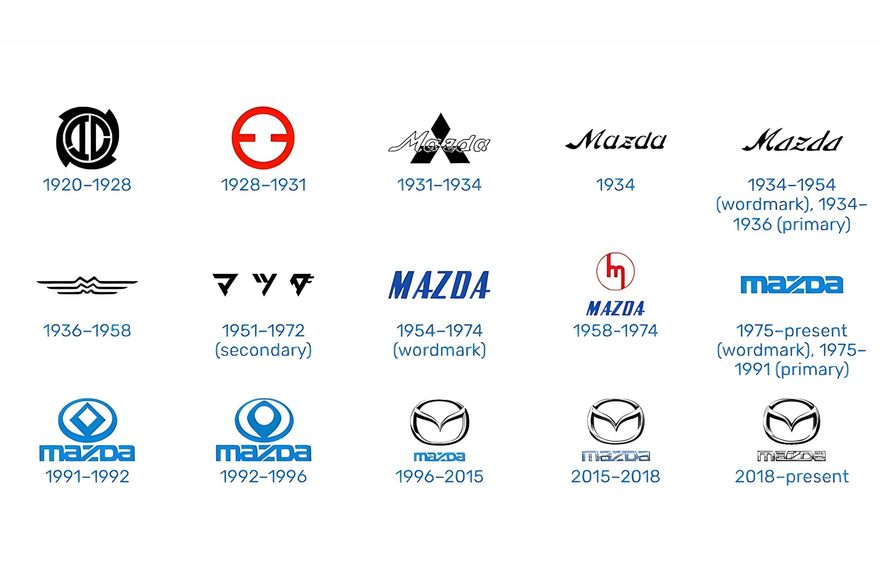
How the idyends of Mazda changed
carbuzz.com
The emblem is depicted two -dimensional, without a metal texture, with pointed faces of the “wings”, inscribed in the oval, the lines of which became thinner. According to unofficial data, the company can continue to use the previous identity depending on the scope of its application.
Jaguar replaced the Opel logo updated the logo: what has changed Lamborghini for the first time in 20 years changed the branded logo
As for the 105th anniversary of the Japanese brand, the official date of the base Mazda is considered 1920. At first, the company produced machine-building equipment and motorcycles, in the 1930s it began to produce tricycles, and the usual name appeared only in 1931. Well, and the first passenger car-the compact compact compartment of the Mazda R360-debut only in 1960.
When Mazda officially introduces a new identity, she will replenish a list of brands that have switched to two -dimensional minimalism. Among these are Volkswagen, Audi, Mini and BMW, Volvo, Lotus, Citroen, Renault, Nissan, Ford, Buick, Lancia, Lamborghini, Aston Martin, Geely, and recently and Jaguar.
Tuning is Japanese